Make your custom components interactive in Semaphor

When building analytics into your app, you'll often run into scenarios where you need to display specific information in unique ways, depending on your industry. For example:
- If want to show goods exported and imported between countries, you might want to use a specialized map.
- For financial apps, you might want to use a table with precise sorting and ordering requirements.
- For HR apps, you might want to use a unique distribution chart to show candidate demographics.
The variety of these charts is so vast and diverse that no single charting library can fulfill all these needs. Most BI tools are tightly coupled to one or perhaps a couple of charting libraries, offering limited customization within their constraints.
This leaves you with two suboptimal choices:
- Lower your expectations of what you can deliver, resulting in a subpar customer experience.
- Build everything in-house, which means developing the necessary analytics infrastructure to support that visual — a huge distraction for your engineering teams.
You'll inevitably face such scenarios as your analytics journey matures and your customers' requirements evolve. If you're locked into a legacy BI tool, implementing these changes becomes extremely challenging. That's why it's crucial to anticipate how your analytics needs might evolve before choosing an embedded analytics tool.
At Semaphor, we're built from the ground up to provide modern analytics experience. Our pluggable architecture allows you to bring your own charting library or even custom components, enabling you to deliver the exact experience your customers desire. This opens up a world of possibilities, allowing you to bring your custom visuals and make them interactive in Semaphor. All it takes is a few lines of code. Let's see how it works.
Before we begin, we assume that you already know how to integrate Semaphor dashboard into your app, or you can follow the instructions here.
Once you're up and running with Semaphor, you can follow the steps below to add your custom visuals.
Step 1: Create your custom component
The repository below includes a basic example of how to create a custom component for Semaphor.
git clone https://github.com/rohitspujari/semaphor-plugin-quickstart.git
cd semaphor-plugin-quickstart
npm install
npm run dev
This starts a local server at http://localhost:5173. You can open up this repository in your favorite code editor and start exploring the code.
In semaphor-components folder, you'll find the custom component that we'll add to the Semaphor dashboard. It's a simple component showing recent sales — about 50 lines of code. It takes a data prop, which is the data to be displayed. But you can make your components as sophisticated as you want.
import { SingleInputVisualProps } from '../types';

export function RecentSales({ data }: SingleInputVisualProps) {
  if (!data || data?.length === 0) return null;

  // get the column keys of the data
  const keys = Object.keys(data[0]);

  // calculate the total sales
  const totalSales = data.reduce(
    (acc, record) => acc + Number(record?.[keys[2]]),
    0
  );
  // format total sales to 2 decimal places and add $ with commas
  const formattedTotalSales = totalSales
    .toFixed(2)
    .replace(/\B(?=(\d{3})+(?!\d))/g, ',');

  return (
    <div className="px-4 bg-background rounded-lg">
      <h2 className="text-lg font-semibold">Recent Sales</h2>
      <p className="text-sm text-muted-foreground mb-4">
        You made {formattedTotalSales} sales this month.
      </p>
      <ul className="p-0">
        {data.map((record, index) => (
          <li
            key={index}
            className=" flex items-center justify-between py-2 border-b border-muted last:border-none"
          >
            <div className="flex items-center">
              <div className="w-10 h-10 bg-muted rounded-full flex items-center justify-center text-black font-bold">
                {record[keys[0]]
                  ?.toString()
                  .split(' ')
                  .map((n) => n[0])
                  .join('')}
              </div>
              <div className="ml-3">
                <p className="font-medium text-foreground">
                  {record?.[keys[0]]}
                </p>
                <p className="text-sm text-muted-foreground">
                  {record?.[keys[1]]}
                </p>
              </div>
            </div>
            <p className="font-semibold text-foreground">{record?.[keys[2]]}</p>
          </li>
        ))}
      </ul>
    </div>
  );
}
Once you are satisfied with your custom component, you need to export it as a named export in the index.ts file. You can export as many components as you want.
import { RecentSales } from './semaphor-components/recent-sales-card';

import '../index.css';

export { RecentSales };
And lastly, you will need to specify how this component should appear in Semaphor console with components.config.ts file.
export const config: ComponentsConfig = {
  visuals: [
    {
      name: 'Recent Sales', // The name of the component that will appear in the Semaphor dashboard
      icon: 'Table2', // The icon of the component
      component: 'RecentSales', // The component exported in the index.ts file
      settings: {
        label: {
          title: 'Label', // The label property of the component
          defaultValue: 'my label', // The default value of the label
          ui: 'input', // The UI type of the label property
        },
      },
    },
  ],
};
Step 2: Publish your component to Semaphor
To publish your component to Semaphor, you will first need to install semaphor-cli. You can do it with the following command:
npm install -g semaphor-cliNow let's initialize a new Semaphor Plugin for your custom component.
You will be prompted to enter your Semaphor project ID and secret. You can get them from your Semaphor project page.
NOTE: Make sure to initialize the Plugin and NOT the App.
~/plugins/semaphor-plugin-quickstart semaphor init
? What do you want to publish? Plugin
? Enter your plugin name: my_first_plugin
? Enter your build path: dist
? Enter your Semaphor Project ID: p_315108f1-d76e-43ab-af8e-d88ccaae59fe
? Enter your Semaphor Project Secret: [hidden]
Config file created successfully!
Once the cli is initalized, you can build and publish your plugin to Semaphor with the following commands.
npm run build
semaphor publish
Step 3: Use your custom component in Semaphor Dashboard
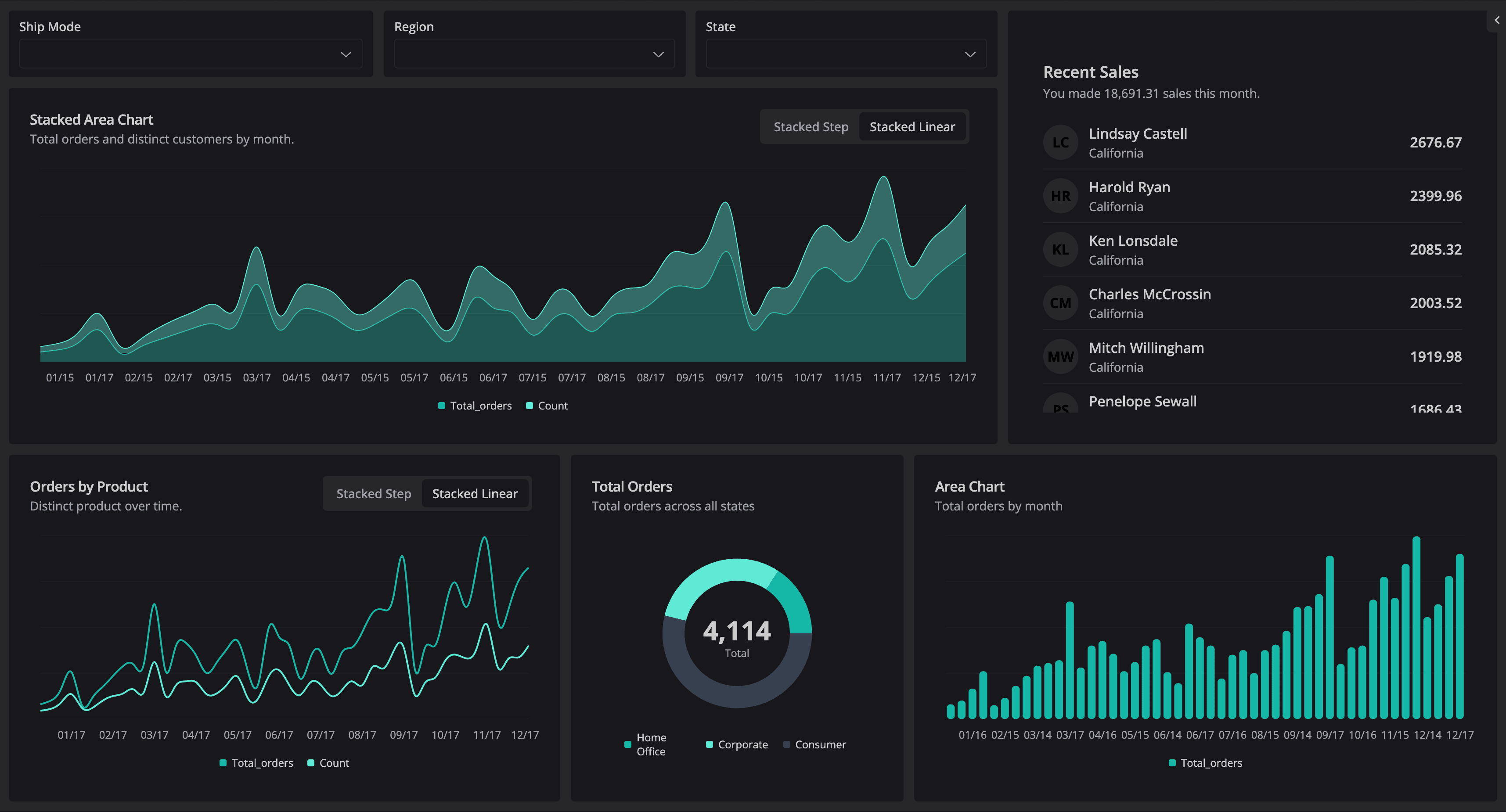
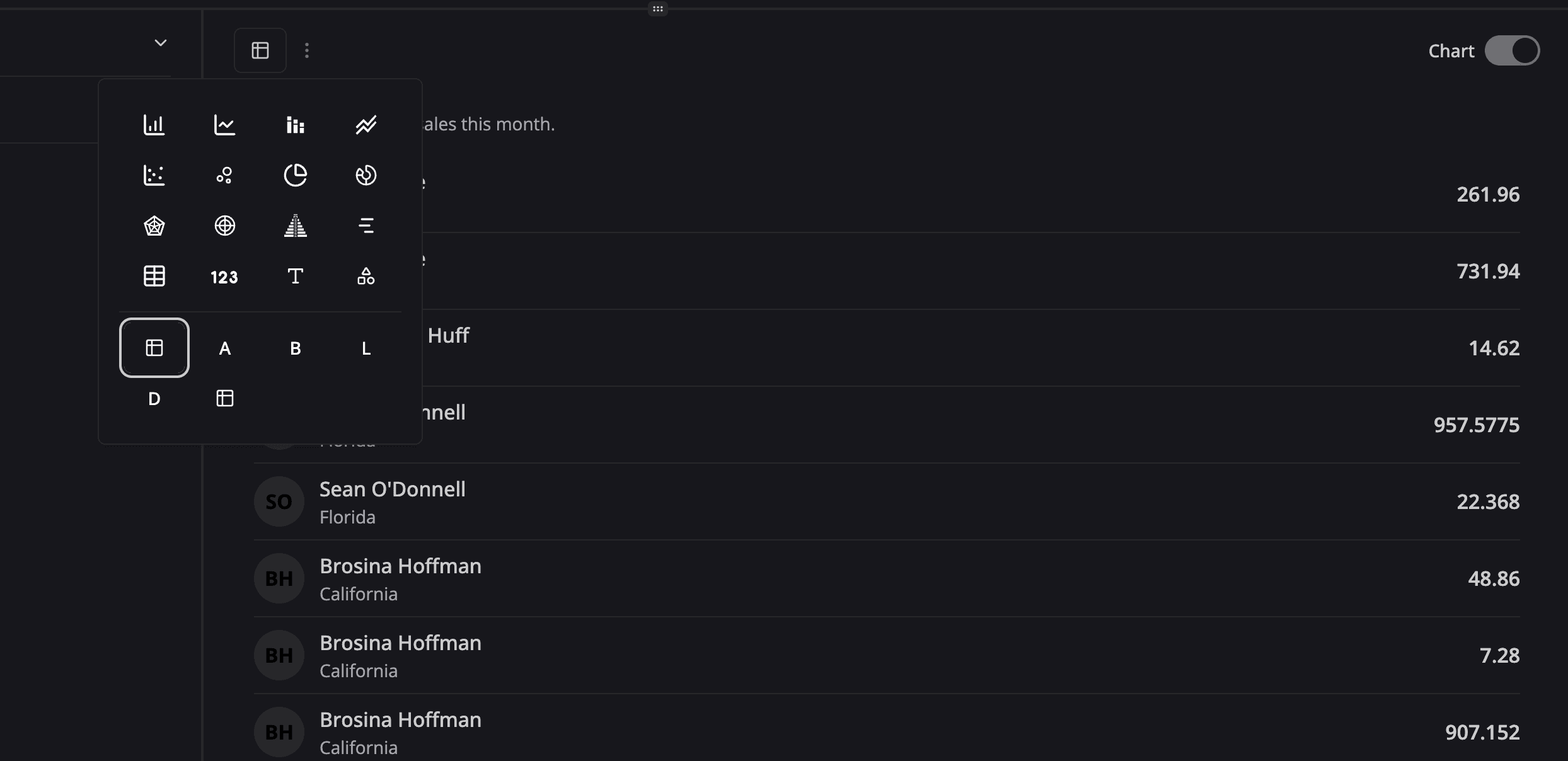
That's it! You can now use your custom component in Semaphor dashboard just like any other visual from the visual selector and make it interactive with the rest of the dashboard.

Here is the sample dashboard (opens in a new tab) with the custom component added. If you have any questions feel free to get in touch with us at support@semaphor.cloud